JAN 2017 WHAT'S OLD IS RE-NEW AGAIN
The new year always brings a sense of new, shiny and wanting to live life LARGE. Yet maybe not so fast & worth some contemplation.
Recently, Richard Meier was interviewed and noted on the growing skyline of Manhattan. To Meier's dismay, Meier feels the need to regain initial investments in Manhattan's land is driving the need to go BIG or go home. No doubt, high NYC real estate prices causes buildings to reach ever higher storeys leaving builders and architects grapplling with re-coup investment strategies.The emerging result is ill-formed buildings that do not compliment the skyline nor add visual characteristics that Manhattanites and vistors naturally reward I.E. the Empire State Building.
Yet, when the effort is made to capture "uniqueness" in form, texture and building materials applied especially when working with an older renovated property...what's old is ‘RE-New’ and emerges as a beacon that compliments the cityscape while commanding, in time, its own justified impressive rent due to its dedication to design not answering to the masses.
Good design, that is “honest” will always have respect for intent, scale and effort.
Rapid fire construction, void of meaningful, thoughtful design and scale, is just that ‘void.’
To read the full article simply click on the link below:
https://www.dezeen.com/2016/12/09/interview-richard-meier-new-york-skyscrapers-disrespectful-donald-trump/
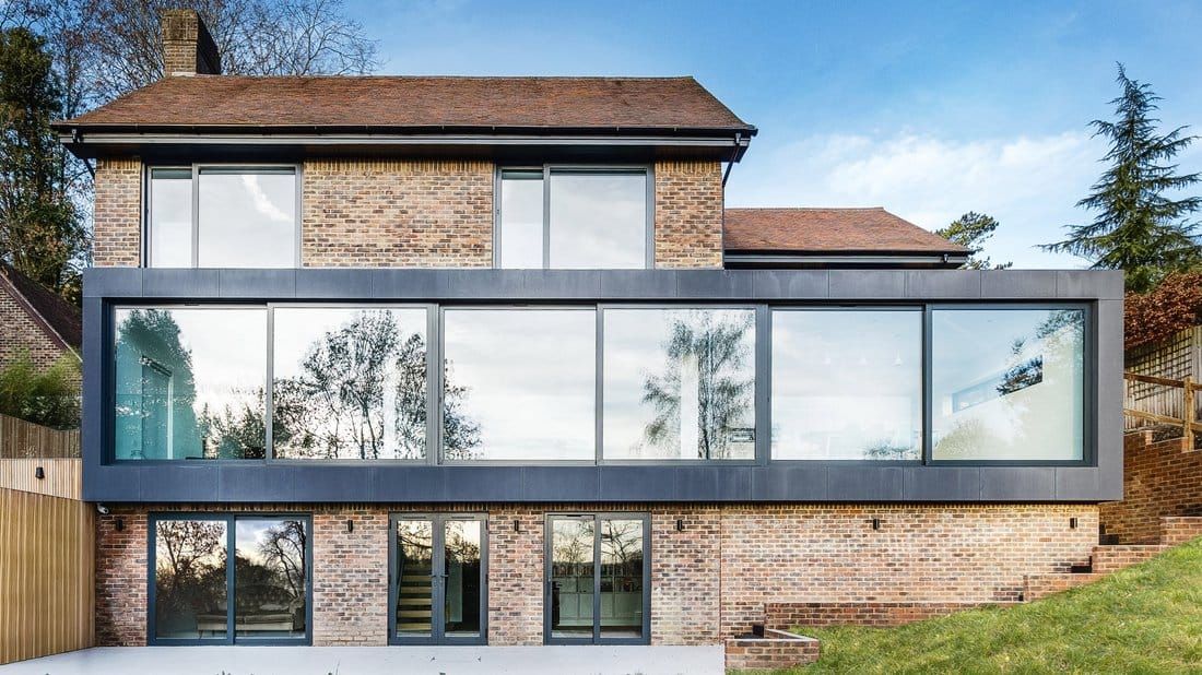
(Above) Case in point, yet removed for the Manhattan and the United States in general, AR Design Studio renovated a portion of a 1970s house in Hampshire, England, with two glass-fronted volumes featuring substantial windows across. The locally based AR Design Studio was asked by the owners of a three-storey-residence in Winchester to increase the size of their living spaces, bring in more natural light and maximise views out over the landscape.
For those of us that lived through the 1970s in the United States or abroad, there was very little architecturally to inspire us. That said, the construction of a house or building was generally solid and without harmful materials such as asbestos that the earlier decades dabbled in. Yet, the result here is quite dramatic and I commend the architects for creating a gesture that while stand-out in its boxed frame reflects the countryside and materials in the vicinity.
The upgrade clearly makes its own statement while respecting the original 1970s structure. I’d be interested in seeing see the brick painted a light dove grey and a weathered grey cedar shingle roof added- perhaps if the budget is there in the future- worth the consideration.
(Above) https://www.dezeen.com/2017/01/02/ar-design-studio-glazed-extensions-1970s-hill-house-hampshire-england/
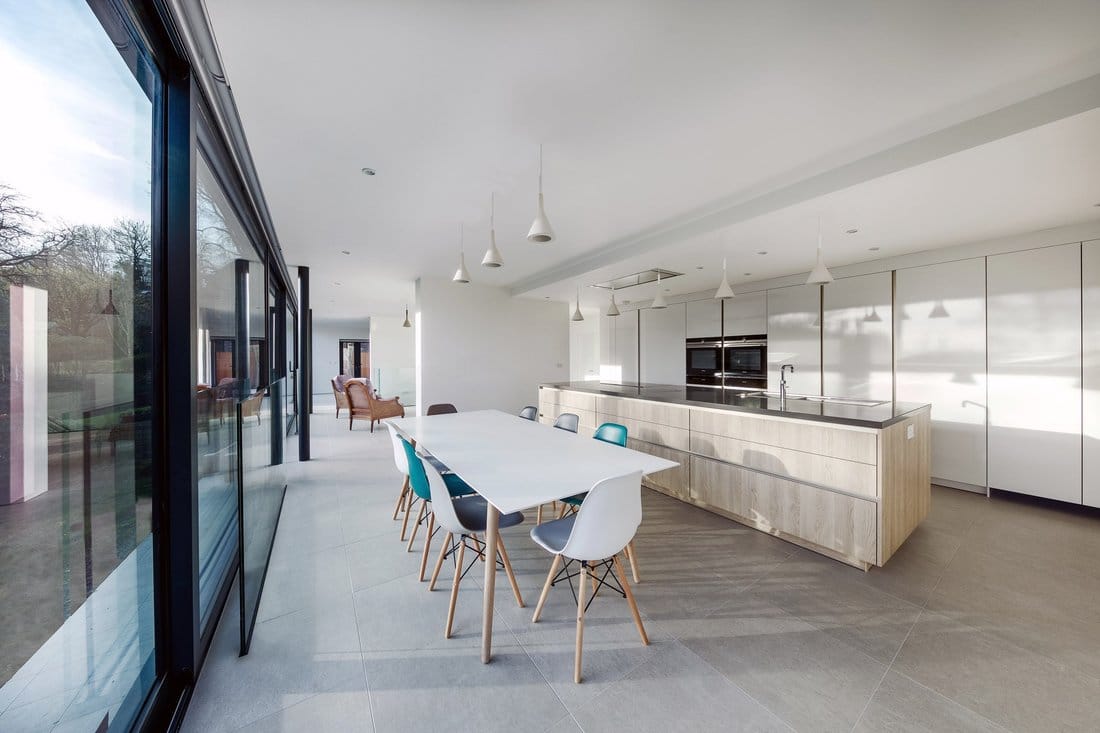
The interior (above) that was created as a result of the renovation provides more than ample space, light and views of the landscape, the new interor provides a facelift in mood and sense of belonging with a re-newed commitment to the environment and moreover original older structure that embraces quite literally, the new.
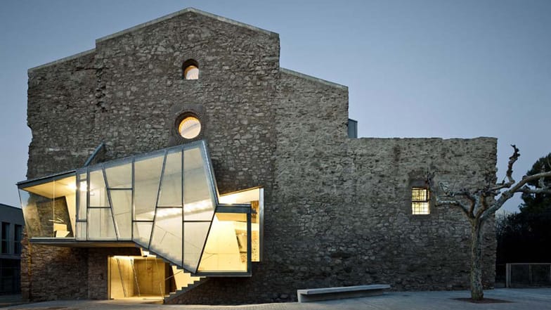
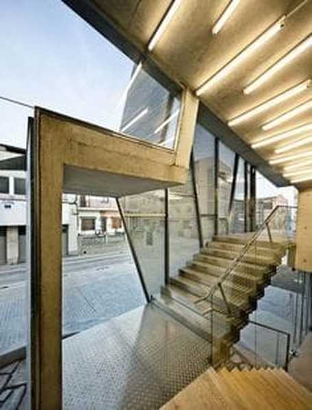
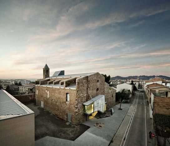
Above, is the renovation of the Church of Saint Francis' Convent in Spain. The Jagged glazed stairwells climb the stone walls of this eighteenth century church in Catalonia that architect David Closes converted into an auditorium. Sensitivity to supporting neighborhood architecture, roof lines and materials was considered resulting in a re-newed purposed with a striking contemporary expression.
The light filled atrium beckons visitors and is an instant billboard for what awaits inside.
Source: https://www.dezeen.com/2012/07/26/convent-de-sant-francesc-by-david-closes/
The light filled atrium beckons visitors and is an instant billboard for what awaits inside.
Source: https://www.dezeen.com/2012/07/26/convent-de-sant-francesc-by-david-closes/
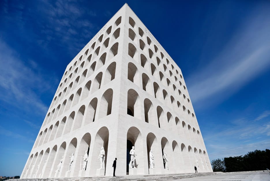
(Below) Italian fashion house Fendi has moved into its new headquarters at Rome's Palazzo della Civiltà Italiana – Designed by architects Giovanni Guerrini, Ernesto Bruno La Padula and Mario Romano, the six-storey Palazzo della Civiltà Italiana was intended to be the centrepiece of Mussolini's new Roman empire, but was abandoned due to his involvement in the second world war. The renovated building reclaimed the buildings qualities of adornment to the human figure. Appropriate for Fendi to occupy the building as it aligns with their company's mission. The mass of the building and impressive cache of lines created by Fendi marry perfectly here.
Source: https://www.dezeen.com/2015/10/27/fendi-headquarters-palazzo-della-civilta-italiana-rome-italy-mussolini-building/
Source: https://www.dezeen.com/2015/10/27/fendi-headquarters-palazzo-della-civilta-italiana-rome-italy-mussolini-building/
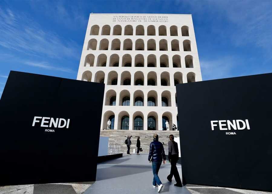
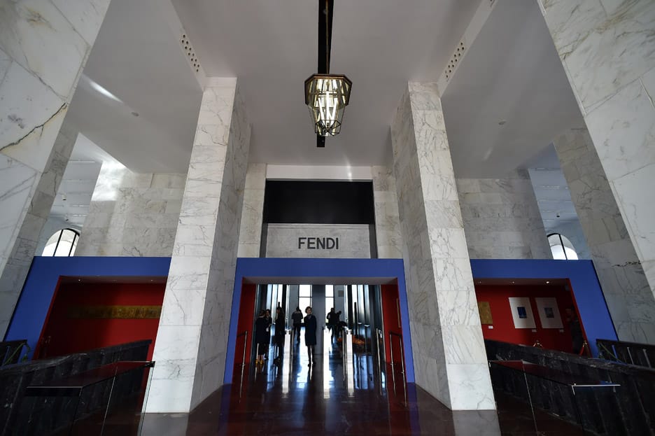
(Above) Despite the scale and use of extensive natural stone along with the imposing black reflective lobby flooring. The bold red and blue that create a defined visitor threshold are as impressive and ground Fendi's presence adding a vibrancy and contemporary feel to the abandoned space.
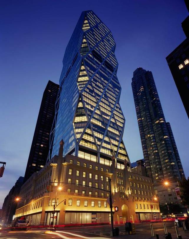
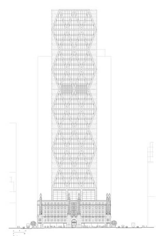
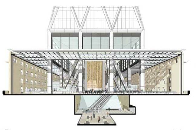
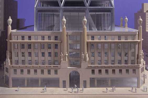
(Above) "A great example of a contemporary addition to a historic building is the Hearst Tower in New York City. The Hearst Tower was designed by Foster and Partners and completed in 2006. The original Art Deco building was constructed in 1920 and was envisioned as a base for a future tower. Seventy years later the vision was reawakened with the design of the “diagrid” structural form rising up from the Art Deco façade. The original façade is maintained at street level and is seemingly untouched to passing pedestrians. However, if you look up you will see a strikingly different vision than before. The Hearst Tower is a beautiful example of how contemporary architecture can be incorporated into historical buildings."
Drawings and video below.
Source: http://www.fosterandpartners.com/projects/hearst-tower/.
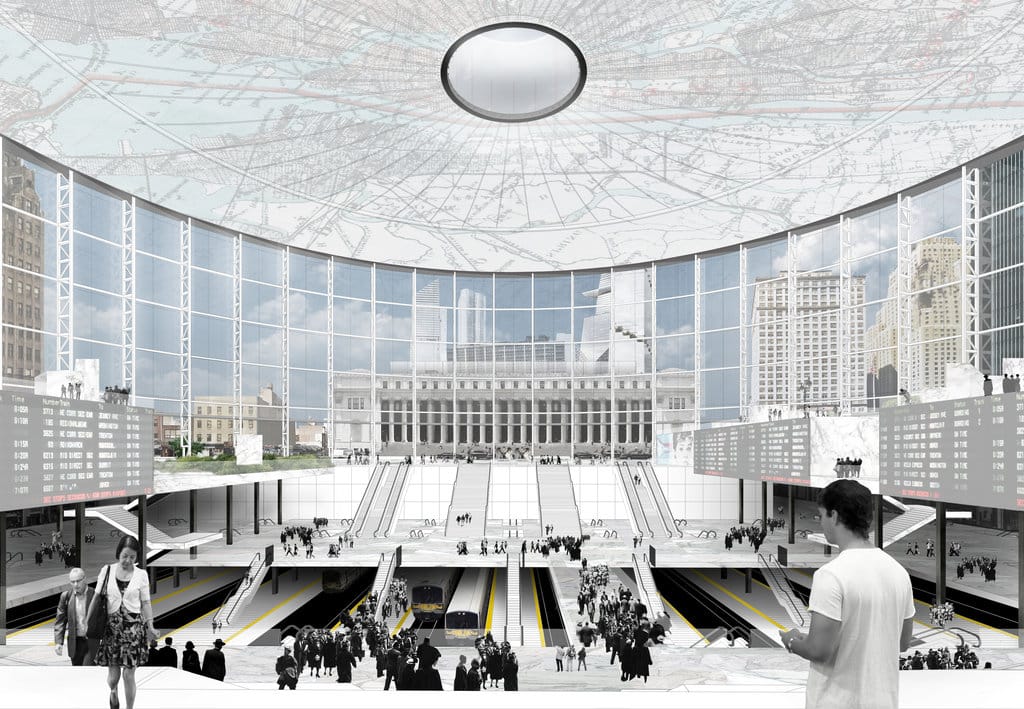
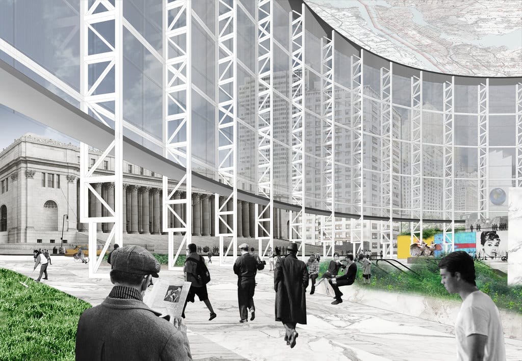
(Below) A prime, architecturally low sitting site that has had for decades, dreams of a complete renovation with a nod to the city, is that of Penn Station. The station built in 1911, was then demolished in 1963. Since then, Penn Station has been on many Governor’s desks to reinvent the hub for the thousands of passengers who commute through it daily. The following is one such design proposal and to learn more simply click on the link here:
http://www.nytimes.com/interactive/2016/09/30/opinion/penn-station-reborn.html?action=click&pgtype=Homepage&clickSource=story-heading&module=opinion-c-col-right-region®ion=opinion-c-col-right-region&WT.nav=opinion-c-col-right-region&_r=0