Express Yourself :)
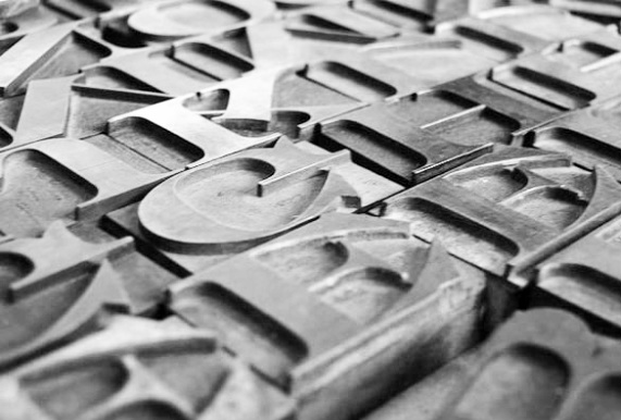
Expression of one’s ideas has always been a creative output, whether in haute couture fashion, on poster art in a lobby or on a massive billboard. However, expression in the arts when paired with words can amplify and transform the artist’s intent to a 'literal' interpretation. The written word when broken down into a typeface has taken on its own art form over the centuries. Typography, a set of characters set into a letterpress is reflected in its unique size weight, style, slant and width. The designer who creates fonts is known as a ‘font designer.’ The world of design was never the same once the “Helvetica” typeface was introduced in 1957 by Max Miedlinger and Edward Hoffman. For the first time, a single unspoken character could express as much power as the spoken word. It was Helvetica that changed the ‘face’ of design forever, and more importantly, the possibilities associated with it.
Image below letterpress: designbuddy.com
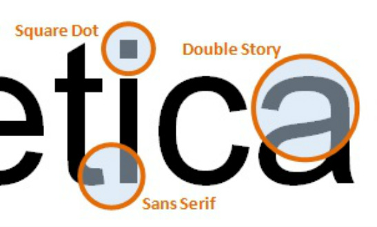
Helvetica provided a form of communication that was the essence of ‘modern.’ As the ad-agency world started to take hold in major cities, so too did the need to provide ‘copy’; a message that did not complicate the imagery of the ad. The more Helvetica was specified, the more it took on its own genre and personality.
Image blow: gravitateonline.com
Companies quickly saw strength in Helvetica combined with a crisp modernity that streamlined their image. ‘Modernity’ translated into technologically advanced, an attribute that many emerging and newly redefined corporations wanted to be associated with.
Image below: popmatters.com

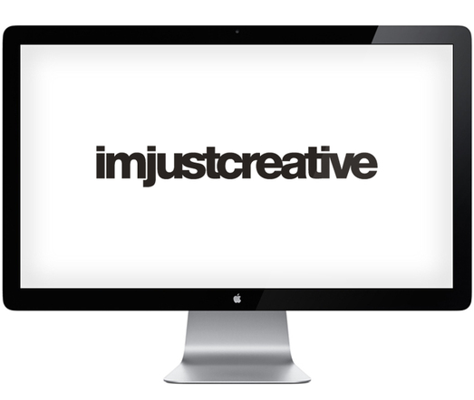
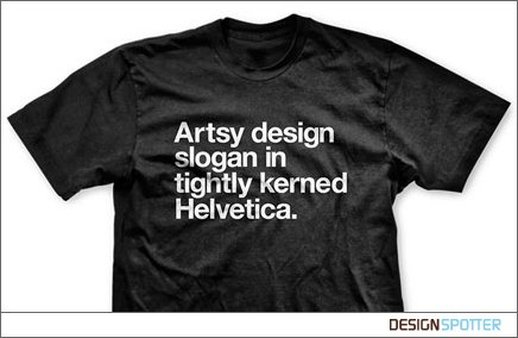
Just when it seemed typefaces like Helvetica could not be any more popular, emerging computers provided font designers a new springboard on which to launch hundreds of characters all clamoring for stardom. Yet, despite the competition to be spec’d or painted on Times Square billboards, Helvetica held steady and transcended from practical, strong and clean to ‘classic.’ As the 20th century faded into the 21st century, a new generation of fans took hold of Helvetica and applied its simplicity to everything imaginable. It seemed Helvetica became the choice font to “express one’s self’ across a multitude of creative mediums. Even a monitor could be considered art when Helvetica graced it. Helvetica was re-born with out ever dying.
Images below: www.imjustcreative.com Tshirt: www.designspotter.com
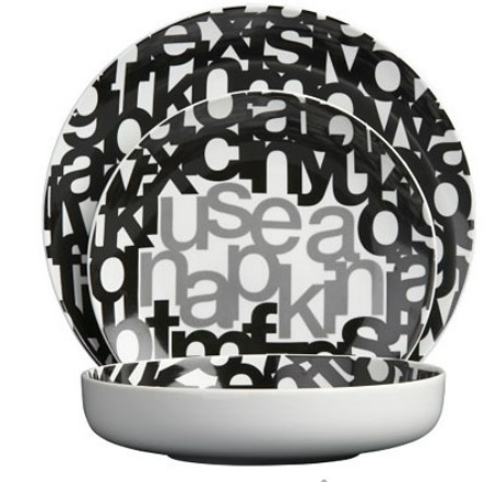
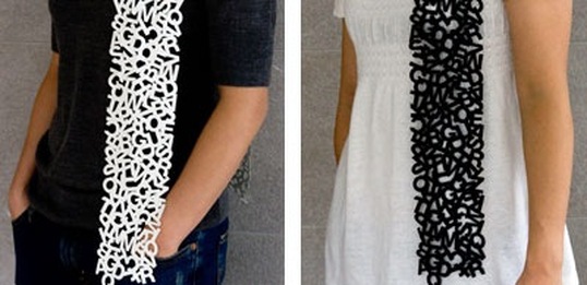
Dinnerware set www.cb2.com Below: www.redhooded.net-scarf once available through Veer.
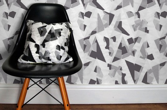
Below:Hand screen print wallpaper-letters by www.sarah-milton.com
Text & fonts soon provided an almost avant garde form of minimalist expression as it took on more meaning & more power when used in the simplest form (i.e.) or as character limited the letter ‘e’ for Microsoft's internet explorer. Soon to express an opinion in 140 characters required a font that did not complicate the gesture of the message. The 140 character tweet had to be clearly interpreted – Helvetica to the rescue once more.
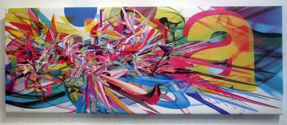
art has emerged & merged including creative new forms of ‘less is more’ expressionism both in tweets as mini daily proverbs and in emerging mural art that radiates from a single letter vs. a subject or studio muse. Mural: woostercollective.com
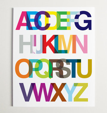
Modern letter art above for a child's room ( www.modernpopdesigns.com ).
Middle Image: Lauren Adam's recent color silkscreen on paper letter wall art "Papel Picado" for Perkins+Will, John Hopkins Hospital Baltimore MD. image: www.InteriorsandSources.com
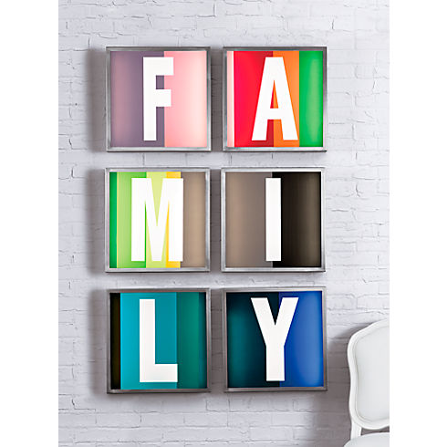
Below for the home: letter light wall art by www.TheNovogratz.com for www.Cb2.com "Light up the Family"

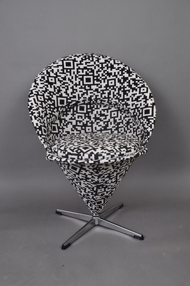
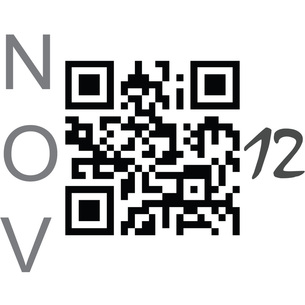
Along with interpretive art one could now include the ‘QR’ code. Another minimalist abbreviation, however a QR image is void of text associated with it initially-until one accesses the ‘hidden meaning’ only to find the message within. Sort of the ultimate fortune cookie concept which adds a visual dimension of curiosity beyond a cryptic image. Artisans who are now interpreting the QR code on their own are similar to the early advertising houses that took a leap of faith with Helvetica and made it their own in the early 60’s defining its status by use. Only to find that Helvetica stood the test of time and paid them back ‘royally.’