THE ART OF THE EDIT
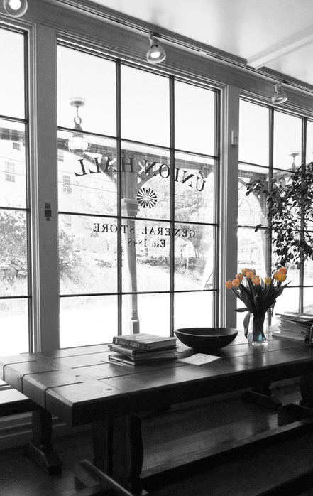
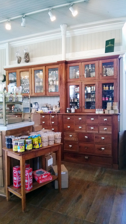
The art of display is indeed a mico-art form on a macro level. Done well, arranged objects can give a sense of purpose and navigation as in a museum setting or to draw in a customer through a narrative display. Recently, I came across a true mastery of ‘all things arranged’ not for what was displayed but more so for the void, the purposeful 'edit' the shop owner afforded the customer to experience-as in what was not overly displayed. At the Union Hall, only miles out of town from Ridgefield, CT in North Salem NY, Jane Beltz, the new shop owner has assembled an assemblage of rustic simplicity with downtown sophistication. Equine accents and offerings dot the interior, but do not overwhelm. Jane left room for thought which becomes the ‘experience’ of the purposefully eclectic yet thoughtful products throughout the space. Union Hall is an homage to the once grandeur of the general store. The architecturally detailed full height cupboards, expansive ceilings and massive white marble carrara counter tops place Union Hall solidly once again within a community and yet despite the strong foundation of history and built-in design elements; Union Hall offers a refreshing 21st century zen-like experience in the renovated original 1848 general store setting. The calculated choice to not overwhelm the customer with stacked and over stocked items allows one to breathe and appreciate the choice selection of hand made items, signature beverages and culinary treats. In this post, I wanted to bring attention to the subtly of display and how when done with elegance and restraint can be like experiencing Union Hall- simply ‘zen-like.’
(next four images-copyright of DesignDriven.Weebly.com)
http://unionhallgeneralstore.com/
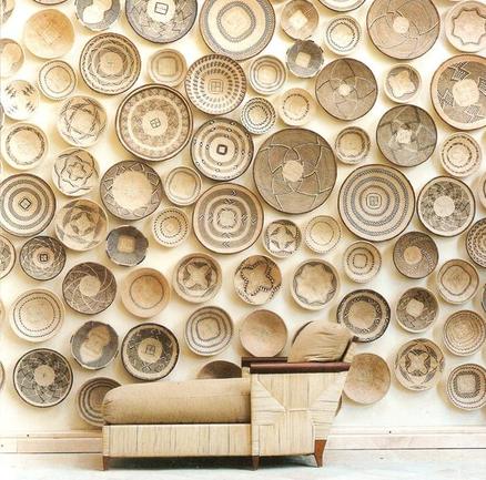
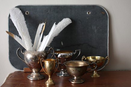
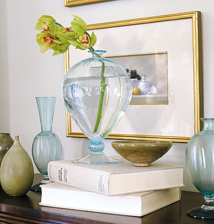
When you think of it, everyday objects, particularly ‘found’ objects can be the most interesting when paired up with unlikely textures or shapes. Sir Terence Conran, founder of Conran department stores, lectured and wrote extensively on the ‘rule of three.’ The power behind displaying only three objects at a time verse one or four. It seems that (3) is enough to call attention and tip the interest factor to purchase but (4) muddies the intent and the consumer or viewer will soon be lost in the display effort. Such thought is not the case in displaying found or collected objects in one’s home. In many instances, like in the case of books the more the merrier, however keeping in mind that the color way should always unite vs. varied colorways, in addition the subject matter should relate if a large scale display i.e. multiple frames, vintage spoons, couture hats etc. Had the African bowls (displayed below) been multi-colored, the wall would have overwhelmed the natural curve and beauty of the chaise. The chaise's neutral color would not have been strong enough to compete or draw attention.
Images below:http://www.gatherandhuntvintage.com/2013/02/interior-styling-workshop-at-vintage.html_http://www.minimalisti.com/architecture/interior-design/01/ethno-elements-from-africa-and-the-middle-east-in-the-interior.html
http://0.lushome.com/wp-content/uploads/2012/11/modern-interior-decorating-ideas-natural-materials-eco-homes-32.jpg
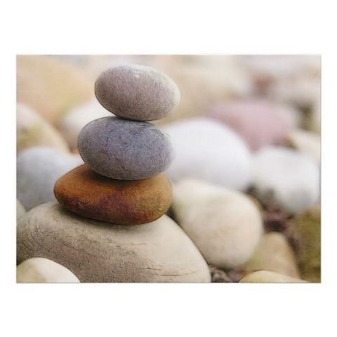
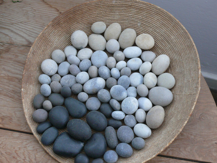
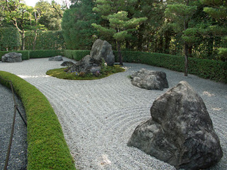
Zen rock gardens are perhaps the ultimate form of editing expressionism in the form of display. Minimal outcroppings of found objects that mimic majestic rock formations and mountains are meticulously placed. In addition, the material on which the rocks rest is of raked gravel, another formation of pattern displayed. Pops of vibrant green moss and shrubbery compliment the grey tonality giving an overall sense of ease in managed care and maintenance. The effect is striking as an ultimate form of display, not vertical but horizontal. Simple assorted and sorted rocks collected can yield micro environments of calm and serenity on their own as well. All contemplative displays that awaken the senses while quieting the mind.
Images below:http://www.zazzle.com/zen_rock_garden_poster-228979563734674627
http://media.oregonlive.com/hg_impact/photo/pathjpg-f238581aef413332.jpg
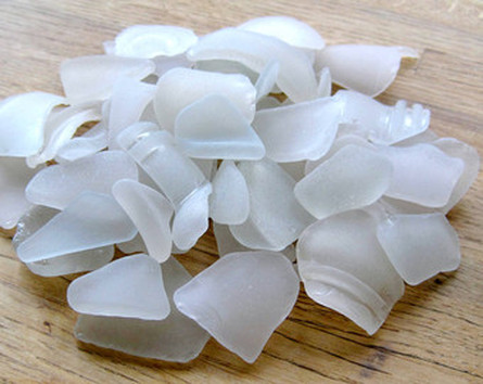
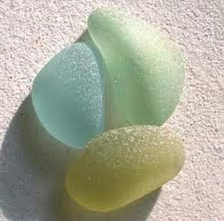
Sea glass in all shades offers not only texture but alluring transparency. Grouped by color or arranged alongside objects of similar hue, see glass makes the ordinary extraordinary while reminiscent of the ocean offering a relaxed tableau to take in.
Images bellow:http://www.etsy.com/market/white_seaglass
http://www.wxystudio.com/carousel.html http://hallready.blogspot.com/2010/05/art-of-display-by-phoebe-howard.html
http://www.myhomeideas.com/idea-houses/favorite-ideas/art-of-display-10000001730474/
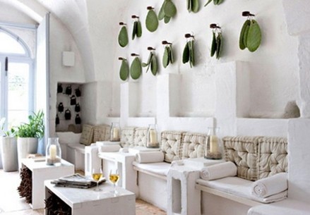
Here (below) cacti leaves adorn a café's white washed wall. The simplicity in repetition and texture is as beautiful as actual framed art. The peg system also enhances the natural imagery.
Images below: http://denoxa.com/interior/decoration-hanging-luxury-design-wall-fantastic-design-wall/designinteriorart.com%5Ewp-content%5Euploads%5E2011%5E07%5Ewall-decoration-with-sculptures http://blog.alicelanehome.com/uncategorized/collections-2/
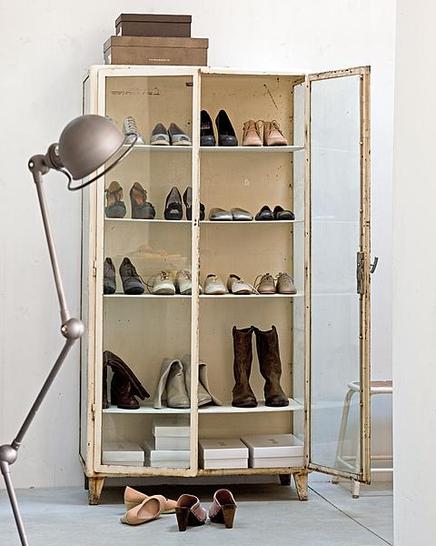
In this instance the unique salvaged medical cabinet and lamp (below) create a distressed boutique look. The shoes are instantly showcased while on display at the same time on a residence. The success here is the tonality of the cabinet. It allows the shoe’s textures and character to pop. Image below: http://pinterest.com/pin/246923992039947529/
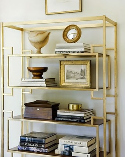
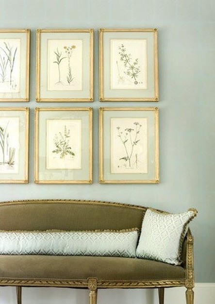
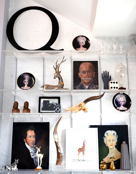
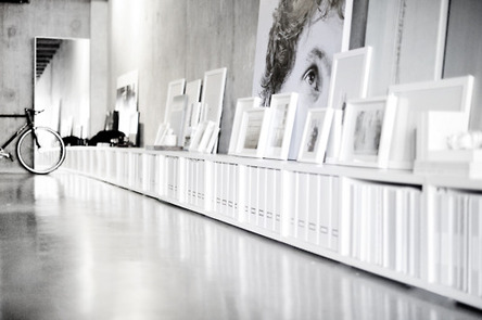
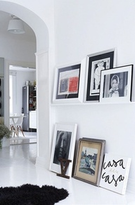
Frames, weather salvaged, purchased or custom instantly offer elegance and character on a wall. Propped up or hung, the art is not only in the frame but how it is laid out and arranged. Even a relaxed approach needs editing. The end result can be either complimentary to furnishings and accessories or stand alone as its own gallery in both instances a little planning goes a long way.
Images below: http://www.quinncooperstyle.com/2013/03/how-to-arrange-shelves/
http://abigailahern.files.wordpress.com/2012/08/art3.jpg
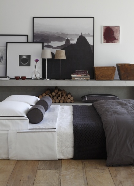
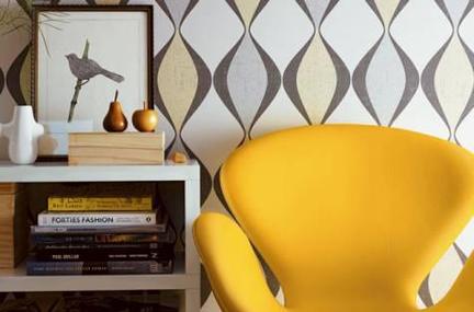
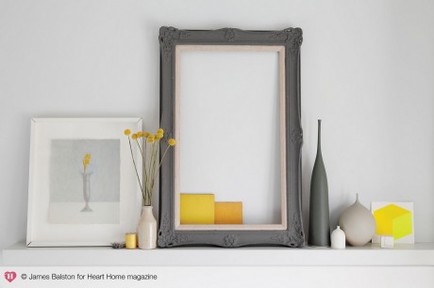
Sometimes it is not what is being displayed but what is not. The void created by the open frame creates interest and redefines the assembly of accessories as an art installation. The modern yellow draws in the viewer while the grey creates an understated elegance and grounds the overall imagery.
Wallpaper has made a strong comeback, yet it is in the pattern that defines what a good wallpaper will and won’t accept displayed beside it. The ultimate editing challenge is to work up against a bold wall covering, in this case success. Image beow: http://theinteriorfactory.wordpress.com/