Not Filling the void
I thought I’d start my blog focusing not the finer details of design but the bigger picture, the overall feeling. Often in Interior Design we get bogged down with the ‘details’ and yet when a space is open and light flows; not filling the void leaves room to breathe and reflect. In many ways the space offers the occupant the opportunity to then imagine, create and ultimately work more effectively. The following images all celebrate the pre-mediated effort not to ‘fill the void’.
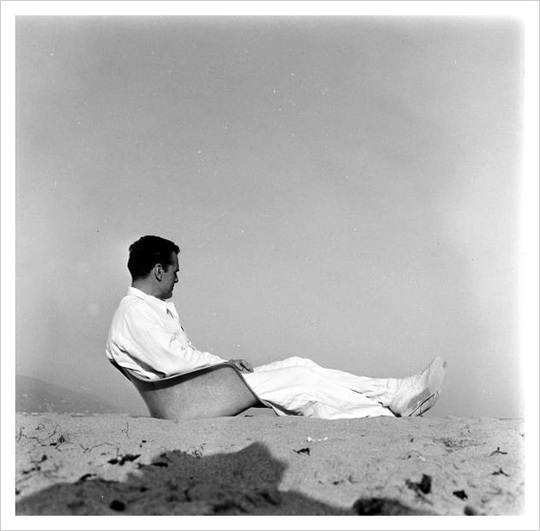
Charles Eames in his fiberglass RAR chair shell, photographed by Peter Stackpole for LIFE in 1952 near Santa Monica, California. Charles and Ray Eames were two of the greatest designers of the 20th century. When we think of the 'Design Process' the Eames' personified it. Their studio was filled to the ceilings with creative film cans, models, one offs and sketches. Yet, despite the numerous re-designs of the classic RAR chair shell, this image says it best; stick close to nature in simplicity and form and the result will always leave room for admiration and interpretation. Here only a few miles away from sea 'shells' did the chair shell form finally evolve.
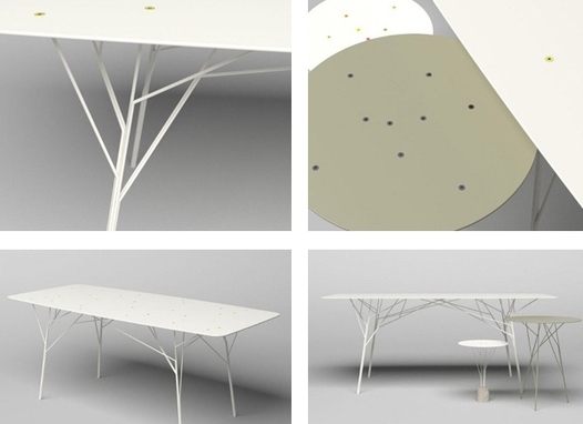
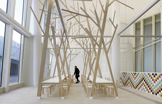
Inspired by nature; the Tree Branch Table by Zhili Liu nestles practicality with form and function yet leaves a void of space to contemplate on. The timeless truss leg design, while branch inspired, is reminiscent of Eames’ Eiffel chair leg base. Instant classic.
The restaurant "A Cantina" designed by Spain’s architects Estudio Nomada does fill the void within the room yet does not evoke confinement. The architecture of the furniture marries the ceiling height with the floorline while casting one’s interest upward. The space goes from voluminous to gallery-like. Beckoning the customer to experience not only the food but the environment they are sitting in. news.infurma.es
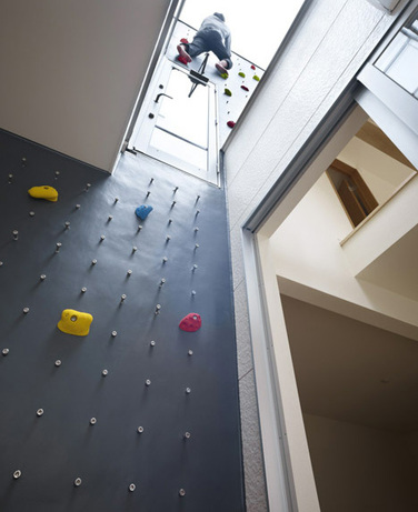
The 3Way house provides a unique opportunity for exercise where a stairs would normally go. The passageway, void of traditional structure offers in exchange bursts of color which creates interest leading one’s eye upward toward the roof top. The physical strength of the stair is replaced by one’s own physical strength to ‘get to the top’. Designed by NAF Architect and Design Inc.
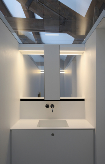
The ‘Island House’ offers visuals of both strength of structure and subtlety of the outdoor views. Neither is obstructed as the vanity takes back seat to ‘being vain.’ The mirror is custom designed and sized to provide basic needs while not complicating the purpose of the house; to enjoy the island it sits upon. Designed by Architect, Karla Menten.
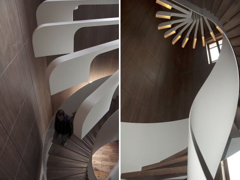
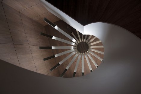
Here, the stunning architecture of the stair design left a void where a light source could have erased the natural sweeping beauty. Instead thought and consideration went into custom designing a luminary that complimented the stair and did not stop the energy that the satir design creates. Designed by PSLAB
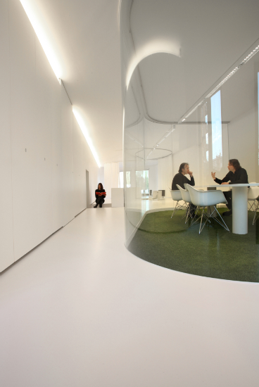
Offices today are more often designed with a collaborative approach defined by ‘open plan’ spaces, often void of floor to ceiling height traditional studded walls. The dilemma is how to address privacy while not closing off opportunities to collaborate or sit in on discussion? The office interior here does both : creating a subtle curve in the physicality of the hallway dotted with seated work privacy nooks. The result is not only innovative but uplifting. Light accompanies the employee where ever they go. Designed by Architect, Karla Menten.
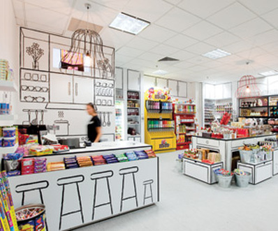
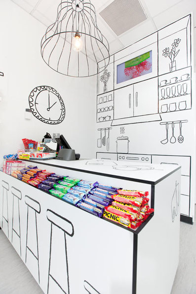
When I think of the details designers spend on procuring the perfect cabinet or display case, this simplified space, more like living retail ‘canvas’ simply amazes me! The child-like gesture drawings in simple black and white do not mask the branded candy lines they provide a platform on which the customer is intrigued by the product’s color, shape and logo. The retail space-'The Candy Room' is effective down to the void of excess material/ wire frame chandelier fixture over the cash-wrap area. Simply Brilliant! Designed by Red Design Group. image: design-milk.com
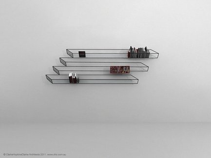
While not part of ‘The Candy Room’ above, this wire frame shelf designed by Clark Hopkins Clark Architects would have been a perfect. Another example of where the void creates interest and in this case fascination with the design process involved.
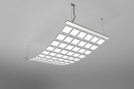
‘Canvis Drape’ an OLED luminaire designed by Acuity Brands Inc. which offers an exceptional light source while providing pattern/architecture to the ceiling landscape. The respite of square design pierced by the void/grid makes this light source contemporary while classic all the same.
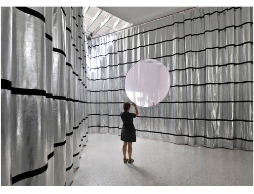
The Venice Architecture Biennale 2012 offers some amazing installations. The simplicity exhibit combined with the metallic fluid drape provides a backdrop of mystique to the porthole. The void in the drapery, the porthole, intigues the viewer. Here is an example of the emperor’s clothes at its best. The exhibit fascinates by purposefully not filling the void. Image by dezeen.com