SPRING BOARD

Funny how a color can be presented, branded, marked and sold to the on looker as anything but itself. In the case of the color or should I say colour grey (or gray) the simplicity of its use can instantly claim fame to chic. Grey however in the case of the weather can convey a feeling of dreariness, macabre as its massive cloud-like duvet hovers and seemingly demands that all remain still and calm under its spell. Yet busy branding agencies and fashion designers alike, despite the weather, turned out storyboards behind the grey city facades and continued their creative work as faithful fans of fashion awaited the the unveiling of 2013 fashion runways of Paris and New York. One could only hope that the suspended mass of collected dewdrops above would be lifted with eye catching hemlines and colorful fabrics. However, this year, ‘grey’ shades did not lift but descended further from the clouds seemingly saturating the runways in Europe and in NYC. Quickly, the fashionista had to convince themselves to embrace the ‘grayness’ rather than reject its ongoing presence. To do the other would simply not be in vogue. Yet- perhaps a marketing stroke a genius as any indication of color like that of a bright yellow spring crocus peeking through the thawed ground was only then magnified against the chic bleakness of the grey. In turn, thrusting the accent color to the forefront and defining the item whether for fashion or home goods use. Grey, as it seems is the ultimate springboard, the canvas, the backdrop for all that is emerging in design.
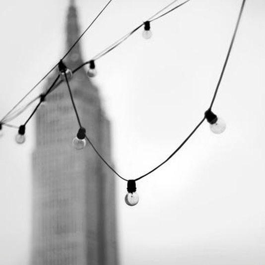
Below image: Grey days against New York's grey facade.
http://www.etsy.com/listing/84662148/empire-state-building-new-york
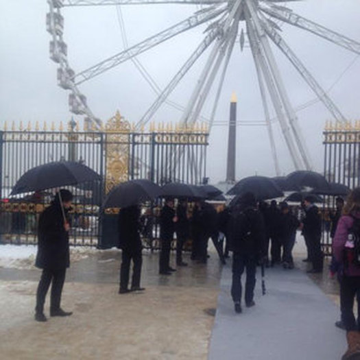
Anxiously awaiting the unveil of the Dior 2013 Fashion show in Paris despite the weather.
Image below: http://uk.lifestyle.yahoo.com/paris-haute-couture-fashion-week-live-diors-spring-132820185.html
Dressed for the occasion in grey tones of simply chic.
Image below: http://le-21eme.com/saskia-de-brauw-paris/

Whether a personal journal or glasses, accessories offer a minimal yet colorful tweak or mesmerizing pattern. A gesture that evokes an emotion that makes elicits the consumer to pick up the object and purchase it.
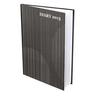
http://www.poundland.co.uk/product-range/a-z/a5-hardback-black-and-grey-2013-diary/
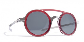
http://www.essentialhommemag.com/a-closer-look-mykita-damir-doma-eyewear/
http://knstrct.com/tag/fashion/
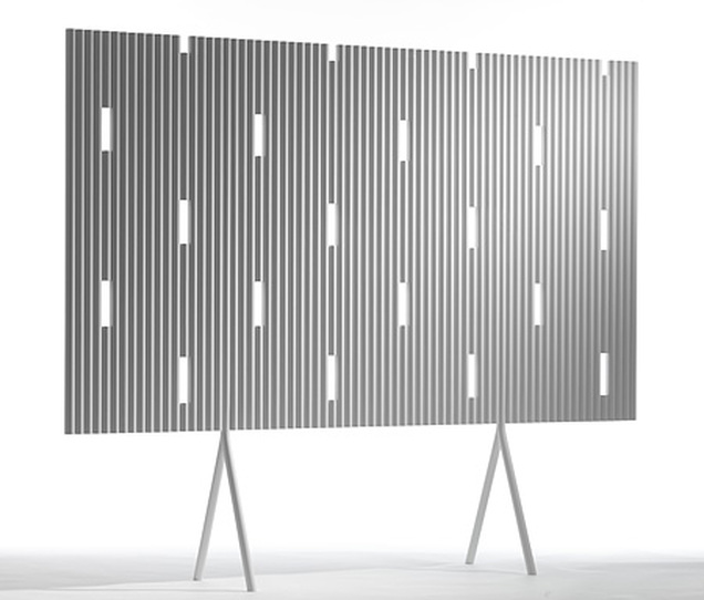
In the design industry, specifically corporate interiors are more and more blurring the lines when it comes to furniture and accessories that co-occupy the workspace. In this instance, a simple room divider is not only elevated but carries a grey pattern that becomes a fashion statement. A pattern that could rival any menswear designer’s choice flannel, the privacy panel while grey is not solely. The clean/contemporary white rectangular stripe offers relief and could as well be bright orange; there is a break in predictability that makes the panel not only instant chic but a classic much like Charles and ray Eames’ folded standing panel for the home or office dating back to the 60’s. No wonder it grabbed 'Best in show" at the recent Stockholm Furniture Fair.
Image below: http://davidreport.com/200702/stockholm-furniture-fair-best-in-show/
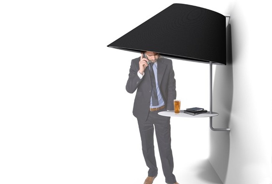
A new product pitch which focuses on a monochromatic colorway with a white resting/table seen below. In this instance, I propose the bold use of color: bright 'orange' or a patterned hood that would not only make a total design statement but alert the person walking by not to walk into the hood.
Image below: _http://www.buzzispace.com/blog/sound-absorbing-lighting-stockholm-furniture-fair
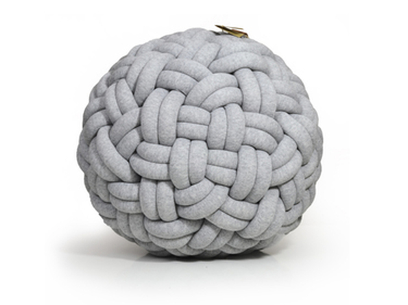
The new knot seat cushion/product below is so unique it does not need color. The intricacies of the weave create continual interest.
Image below: http://en.dawanda.com/product/31027989-Miniknotty-pouf-gris-clair
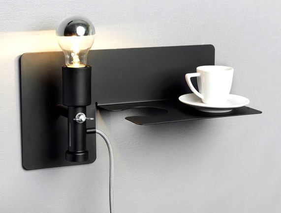
The novel silver bowl lamp and the beverage rest/combo is minimalist design at its best. While virtually colorless in approach the silver bowl finish gives this design panache and presence.
Image below: http://www.modresdes.com/2010/06/sunday-lamp-at-stockholm-furniture-fair-2010-by-martina-carpelan-for-northern-lighting/sunday-lamp-at-stockholm-furniture-fair-2010/
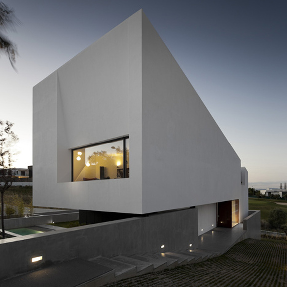
Architecture has always had a love affair with grey, its simplicity allows the form to shine and the mixed use of building materials can stand out if their mixed-in color remains neutral. The residence below is purposely pierced with the rigid formality of a rectangle shape for a window and yet the illumination and warmth the interior light sheds beyond the window becomes the art with the residence's grey box defining the perimeter like a modernist frame.
Image below: http://www.dezeen.com/features/slideshows/
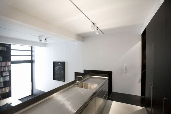
It seems more and more that the kitchen's functionality is stripped to bare use. The effect allows the kitchen to flow seamlessly into other spaces. Once ideal for 80's city loft living; the grey tone of the stainless steel counters below have crossed over blurring the lines between art and an weekend chef's dream stage on which to cook and entertain for guests below.
Image below: http://www.ciiwa.com/elegant-black-and-white-warehouse-interior-design/glossy-grey-kitchen-table-near-black-cabinets/
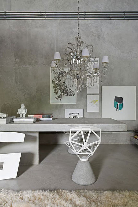
Expectations of grandeur living too have been blurred. The chandelier, once reserved for the dining room has since migrated into master baths and now the home office. Grey tones of neutral glass iridescence shower light above and below while at the same time provide much needed reflectance to draw the admirer into the space. Concrete, in this instance, is the finish and the structure. However, and the flatness of the concrete beckons the ornamentation of the chandelier. It is the art that is the neutral component offering a respite of color in small amounts balancing the two- the massiveness and finish of the concrete against the chandelier.
Image below: http://cimots.com/interior-design-and-decor/warm-gray-interior-design-in-natural-cements-concept.html
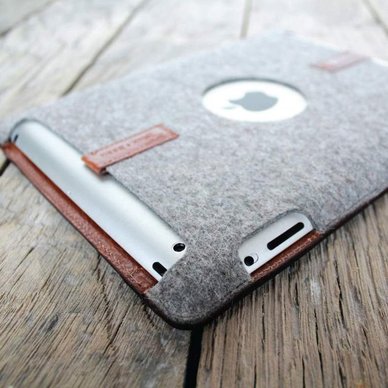
If one looks closely, amongst the grey palette offered this past month in fashion week and throughout furniture fairs globally illustrates a subtle shift , that of emerging color. Always a fan of grey, I admire designers who offers glimpses of color in innovative ways. A stripe, a pocket, a material that like the warm toned weathered leather iPod case as seen above when contrasted against the grey flannel warms the product's appearance enough to make it simply stunning.
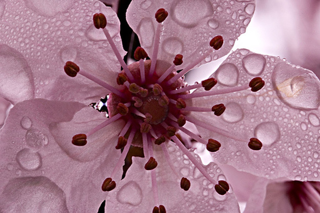
Image below: http://lunarimage.imagekind.com/store/imagedetail.aspx/9118a855-d561-44c0-b120-4cee4567df5d/Cherry_Blossom_Snow_Globe

...and before long, as winter fades into spring so too will the the shades of grey that have been our environment. Buildings, sidewalks, billboards all covered will snow and ice will give way to life in shades of pink on pedestrians faces and on Broadway's massive billboards summoning in all that is spring.