SEPT 8 GO BIG OR GO HOME
They say ”Go BIG or go home” translation…Give it all you got! Typography can do just that go really BIG on billboards in Times Square however small text can just be as powerful like the word Apple on the back of a device. It really comes down to how the font is designed and presented that will make or break the initial impact. Design in the world of typography still bows to the font world of ”Helvetica” and I have blogged extensively on Helvetica in the past, its origin, its mega industry fans. I am referring to the bigger picture of typography as design…ahh now that’s eye catching. Words, letters and text past the need to translate knowledge have taken on an entirely new meaning IMPACT, design impact that is.
The right font can add punch to any interior and the right scale can hit it out of the park. Robert Venturi and Denise Scott Brown traveled to Las Vegas in the early seventies and the famous architectural duo took note of the Vegas strip and more so the massive expression of words as art and buildings that supported the words, literally. Upon return Venturi/Brown published “Learning from Las Vegas” Never before in the United States were buildings erected that also had to erect and support weights dedicated to single letters, numbers and arrows, lots of arrows pointing the way to the best casino Johnny Cash and Elvis were performing at. Yet, it worked somehow and the crowds came. Money flowed thanks to the power of the font.
Times Square was equally as enchanting with its neon illuminating the city for miles around and from space, but it was dampened by neighboring sections of New York that were not lit up 24/7, Vegas was. I have kept my eye on font and its emergence in design over the past few years but only now have I seen an entire branded store dedicated to the love of font or a travel agency that centers its design on the construct of text. We have come a long way from canned alphabet soup indeed.
Earlier blog on Helvetica: http://www.weebly.com/weebly/main.php.
Below, Venturi in Las Vegas Image:http://www.theguardian.com/cities/2015/feb/09/las-vegas-strip-learning-temple-excess
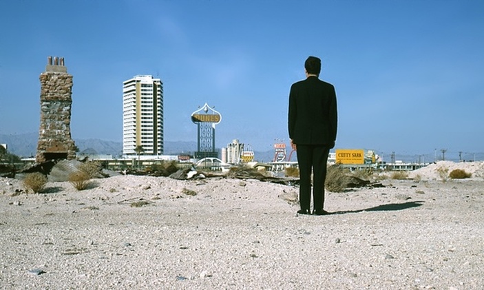
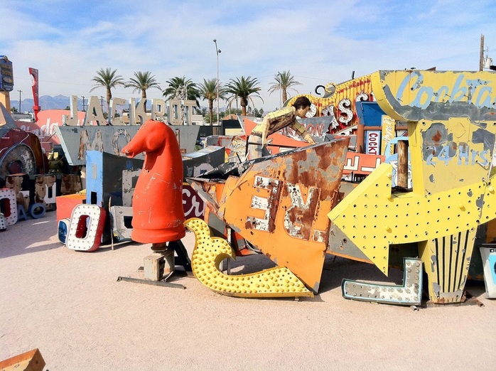
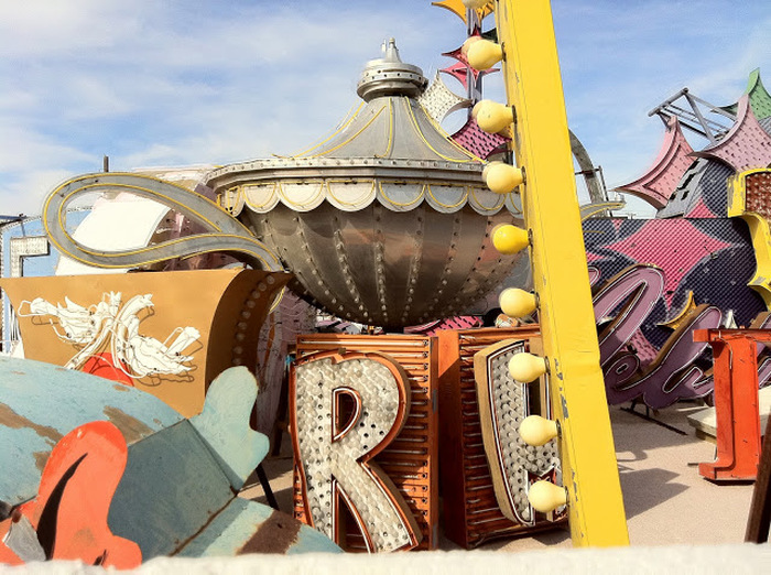
Today, only remnants of the Vegas strip remain mostly in signage graveyards visited only by occasional dust, suet and a bargain hunter. However, the collective colorful imagery is remarkable and denotes a past that recognized marketing and the need to Go BIG or go home. It was literally a matter of survival=jobs.
http://www.moderndesign.org/2012/01/best-of-las-vegas.html
http://www.moderndesign.org/2012/01/best-of-las-vegas.html
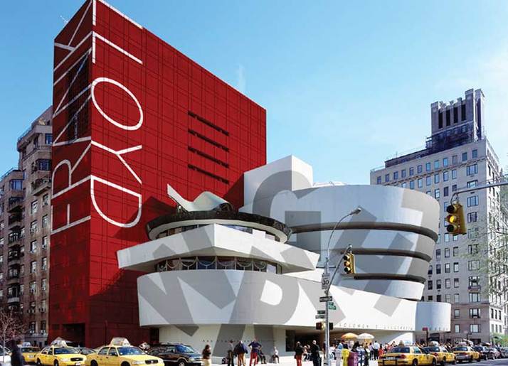
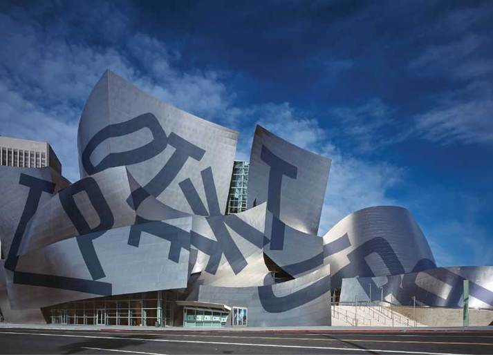
Today's imagery is now highlighted, pronounced splattered in single words as fused in with the architecture. Font meaning or no meaning has elevated to meaning in itself. Translation? you do not have to get it or understand it you just need to absorb the overall effect and ideally impact. Daylight now illuminates the gesture no high intensity discharge lighting required.
(two) images below: http://www.typotecture.net/muo.html
(two) images below: http://www.typotecture.net/muo.html
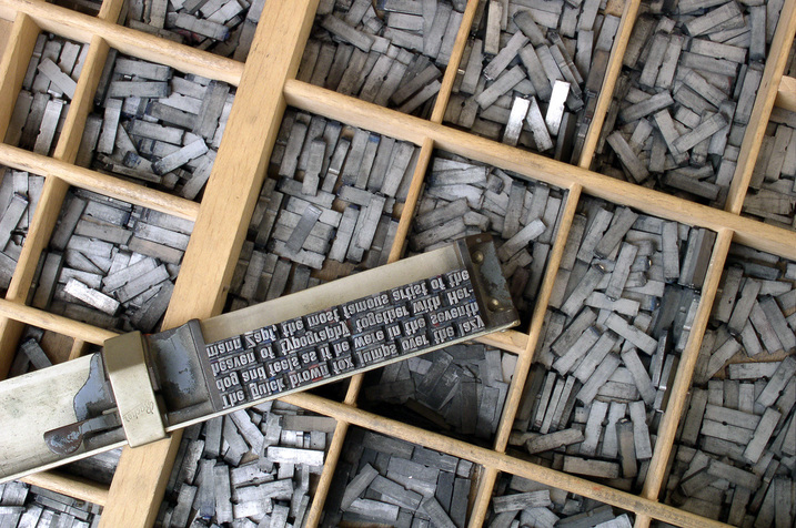
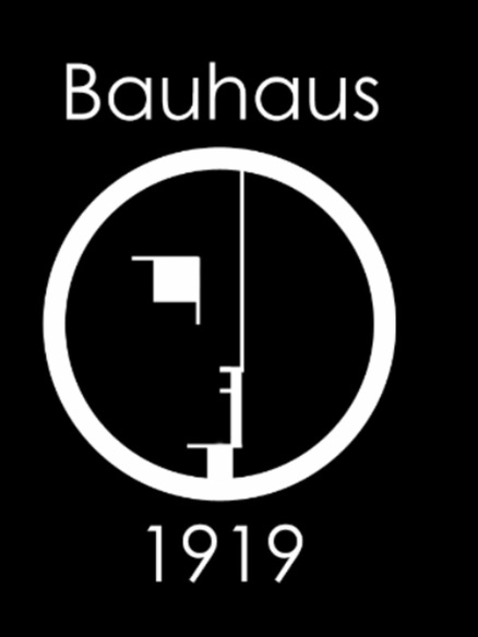
The exploration of font and incorporating it for design sake really took hold in 1919 at the Bauhaus, reducing the message to the simplest form was the challenging while maintaining clean lines and presentation. While typesetting has been around for hundreds of years it was really the early 1900s that moved away from the message in the advertising to exploring font for simply design sake.
Image below: http://abduzeedo.com/bauhaus-influence
Image below: http://abduzeedo.com/bauhaus-influence
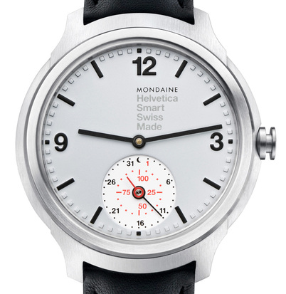
"With only 1,957 pieces produced worldwide, the Mondaine Helvetica 1 Smart 1957 Special Edition is truly befitting of the oft used label of “limited edition”, with each unit marked with a “1 of 1957” inscriptions on the side of the case. But while the limited nature of these timepieces will no doubt stoke desirability amongst horologists (and those with a deep affinity for typography), it’s the special edition’s understated integration of technology hidden within the exterior of confident tradition which makes Mondaine’s smart watch a noteworthy entry into the ever-growing wearable smart device category."
Link: http://design-milk.com/timely-intelligent-mondaine-helvetica-1-smart-1957-special-edition-watch/mondaine-helvetica-no1-smart-watch-hero/
Link: http://design-milk.com/timely-intelligent-mondaine-helvetica-1-smart-1957-special-edition-watch/mondaine-helvetica-no1-smart-watch-hero/
Font and design mix has created fascination and art at the same time.
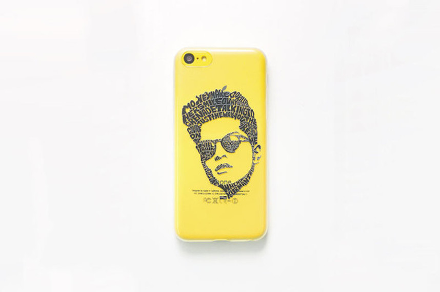
"You might know artist and designer Sean Williams under his Seanings moniker, but if you don’t, you should. Sean creates hand illustrated portraits out of typographic designs. Meaning, the person’s face is made up of lyrics from that person’s songs. Sean has partnered with Casetagram to bring these Typography Portraits Collectionto your iPhone 5, 5s, and 5c devices. Now, it looks like they have the line for all the various devices, like the Galaxy S II, S III, S4, the Galaxy Note, II, III, the Nexus 4 and 5, and more."
Link:
http://design-milk.com/casetagrams-typography-portraits-cases-sean-williams/
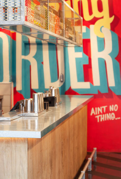
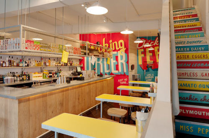
When type and menu collide bigger is better especially when a punch of color is added, the food palette awakens.
"Shed designed the London-based fried chicken eatery, Wishbone, located in Brixton’s indoor market (below). The look and feel of the space was inspired by where “some of the most exciting restaurants overlap with green grocers and wig shops.” Basically you have a vibrant, type-based design centered around wood and an eye-catching color palette."
Link: http://design-milk.com/wishbone-restaurant-by-shed/
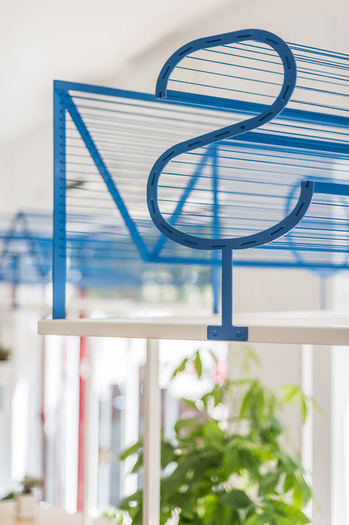
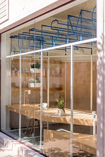
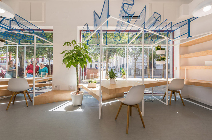
(Below) Remove most of the color and just let the sun illuminate the text and you have a brilliant marketing and design concept in one.
Inexpensive to say the least yet super effective as experienced in the tourism shop below..once all is moved in of course.
Link: http://design-milk.com/modern-tourist-office-spain/alcazar-san-juan-tourist-office-pkmn-architectures-9/
Inexpensive to say the least yet super effective as experienced in the tourism shop below..once all is moved in of course.
Link: http://design-milk.com/modern-tourist-office-spain/alcazar-san-juan-tourist-office-pkmn-architectures-9/
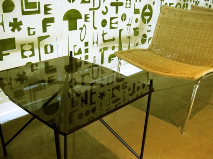
In another interior, even though no text exists only suggestions of what could be perceived as...an example of how it does not take much to make in impact. Simple furnishings need not compete with the wall application. Add just the green and it draws one in.
Image: http://www.graphicdirt.com/tag/typography/page/7/
Image: http://www.graphicdirt.com/tag/typography/page/7/
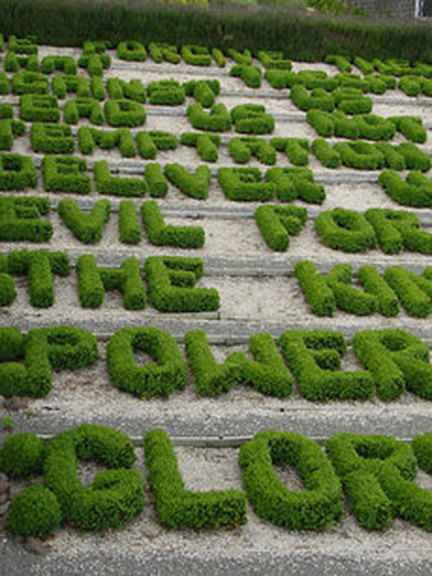
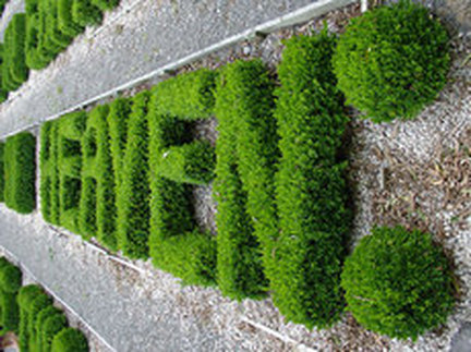
Stroll outside and you will find gardens attempting to capture text as art-forms in all shapes and foliage.
Link: http://www.myurbangardendecoguide.com/2008/01/the-typographic.html
Link: http://www.myurbangardendecoguide.com/2008/01/the-typographic.html
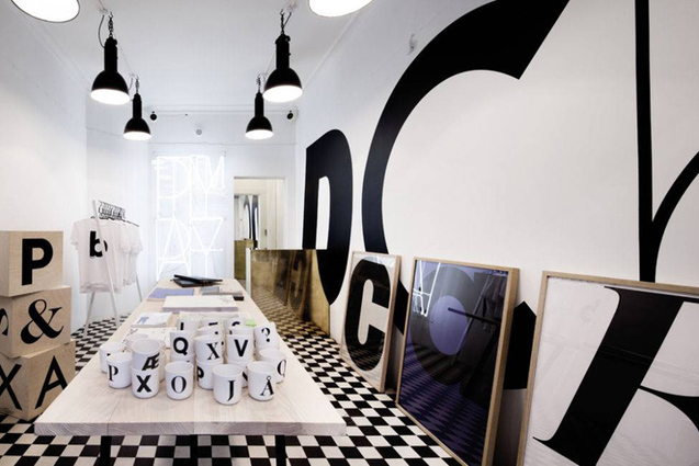
From gardens to pop up stores, font is BIG business now and proof of this is... "The World’s first bricks and mortar type
foundry. Playtype is the physical manifestation of the brand’s established
online font shop. e-Types wanted to make a playtype.com in 3D. The third dimension is the
physical experience of typography – a new dialogue with a wider audience about
the significance of typography as an element of lifestyle. The shop is a
playground where we experiment freely with ideas that somehow relate to
typography. What was a shop yesterday is a gallery today and may just be an exhibition
opening tomorrow."
Link: http://retaildesignblog.net/2013/01/21/playtype-concept-store-by-e-types-copenhagen/
Link: http://retaildesignblog.net/2013/01/21/playtype-concept-store-by-e-types-copenhagen/
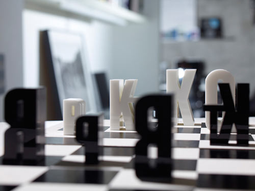
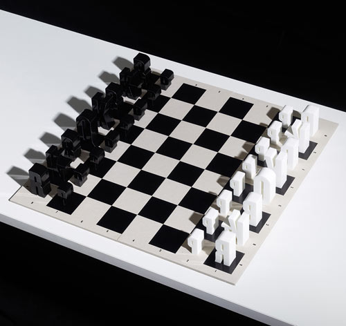
...and so is the stock coming in...everything from T-shits to chess games there is no limit to what designers may label next.
Image: http://design-milk.com/typechessset-by-hat-trick-design/
Image: http://design-milk.com/typechessset-by-hat-trick-design/
Next time you pass by an object, look again it may not be what you think it is comprised of...
The paint brush is now competing with the stroke of a font key.
Can you say C0OL?
The paint brush is now competing with the stroke of a font key.
Can you say C0OL?