JUNE 12 LIFE AS ART

It was Oscar Wilde who said "Life imitates Art far more than Art imitates Life". He went on further to say… "results not merely from Life's imitative instinct, but from the fact that the self-conscious aim of Life is to find expression, and that Art offers it certain beautiful forms through which it may realize that energy." Often, we seek inspiration that flames our passion, zest for life and innovation. Art in many forms affords one the opportunity to interpret and cast their opinion, thus providing meaning. Yet, in design, physical art is often framed and displayed in a way with a surrounding interior depicted in “safe” neutrals, a purposeful stagnation of color suspended so the art receives the limelight, not the space that supports the "featured" art.
But an about face experience as was recently created in a NYC Chelsea Art Gallery; Gemini G.E.L. at Joni Moisant Weyl. Contrary to the gallery wall "white" norm, the artwork exhibited is done so against brightly painted wall backdrops. The art is not lost but becomes more vibrant, more expressive, more engaging. “When you look at art on a white wall the first thing you see is the frame, but when you look at art on a wall with color, the first thing you see is the art,” Mr. Stamberg.
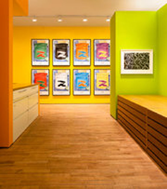
In residential settings, sporadic use of color is more the mainstay due to the massed collections of life’s “things” yet in the office environment and settings such as education, when students progress beyond elementary school colorful usage starts to fade along with inspiration. Offices too tend to exclude colorful use-so not to be seen as potential distractions beyond the carefully selected framed art. The need to change out color from year to year is defrayed, which is perceived as a costly financial outlay later on. Yet, color when introduced effectively can be like the Chelsea Art Gallery experience, in that, inspiration and ideas flow more freely by the end user not distracting. A similar energy and design practice could permeate and assist students and office workers alike to stay engaged. Students today, in grades K-higher education, apply long hours and so do their parents in corporate settings, re-examining their spaces may help many across the paradigm of tasks needed to be completed. With a little color theory knowledge it can be done right and possible inspire the next great innovative product or discovery...now that's priceless.
Below, the Chelsea Art Gallery exhibit: http://www.nytimes.com/2014/06/09/arts/design/an-invasion-of-color-at-chelsea-art-gallery.html?ref=design&_r=0
But an about face experience as was recently created in a NYC Chelsea Art Gallery; Gemini G.E.L. at Joni Moisant Weyl. Contrary to the gallery wall "white" norm, the artwork exhibited is done so against brightly painted wall backdrops. The art is not lost but becomes more vibrant, more expressive, more engaging. “When you look at art on a white wall the first thing you see is the frame, but when you look at art on a wall with color, the first thing you see is the art,” Mr. Stamberg.
In residential settings, sporadic use of color is more the mainstay due to the massed collections of life’s “things” yet in the office environment and settings such as education, when students progress beyond elementary school colorful usage starts to fade along with inspiration. Offices too tend to exclude colorful use-so not to be seen as potential distractions beyond the carefully selected framed art. The need to change out color from year to year is defrayed, which is perceived as a costly financial outlay later on. Yet, color when introduced effectively can be like the Chelsea Art Gallery experience, in that, inspiration and ideas flow more freely by the end user not distracting. A similar energy and design practice could permeate and assist students and office workers alike to stay engaged. Students today, in grades K-higher education, apply long hours and so do their parents in corporate settings, re-examining their spaces may help many across the paradigm of tasks needed to be completed. With a little color theory knowledge it can be done right and possible inspire the next great innovative product or discovery...now that's priceless.
Below, the Chelsea Art Gallery exhibit: http://www.nytimes.com/2014/06/09/arts/design/an-invasion-of-color-at-chelsea-art-gallery.html?ref=design&_r=0
About the exhibit: http://www.joniweyl.com/_exhibitions/2014/ART%20ON%20COLOR/Art_On_Color.html#Art-on-Color-8
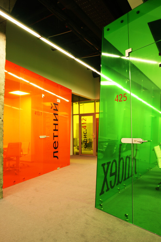
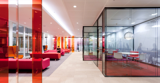
One may start out with a painted colored wall as in the gallery exhibit above but end up taking it to the next level in the office offering transparency with color.
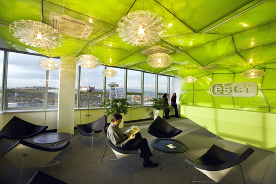
Never to be excluded, the ceiling can make a powerful statement and inspire simply by form and functionality blended with color.
http://officesnapshots.com/2012/02/14/inspiration-35-amazingly-bright-bold-and-colorful-offices/
http://officesnapshots.com/2012/02/14/inspiration-35-amazingly-bright-bold-and-colorful-offices/
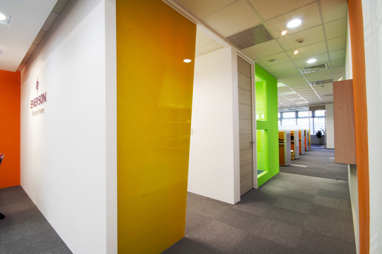
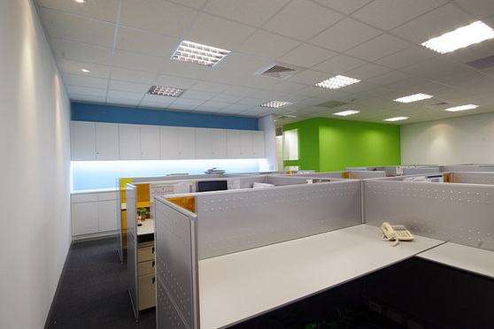
If a departure from rectilinear walls is not an option...just reflect on how simple paint color changed the office landscape below.
http://www.behance.net/gallery/Emerson-Office/8160577
http://www.behance.net/gallery/Emerson-Office/8160577
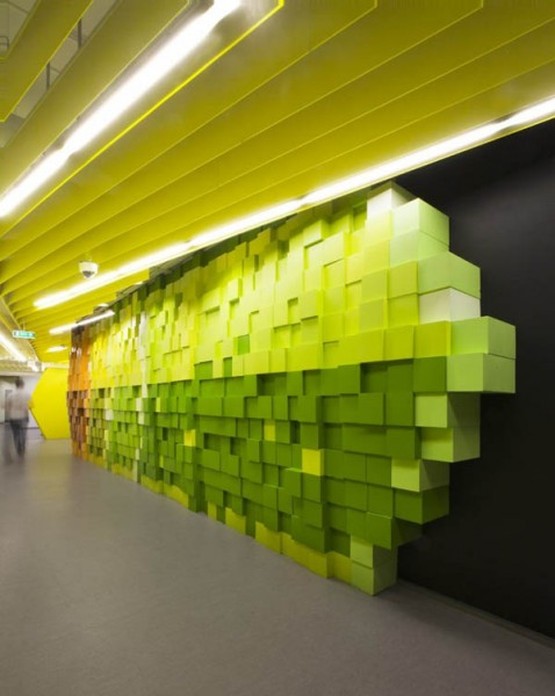
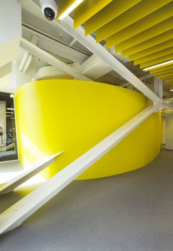
Another creative option is construction an artful installation that combines wall perception and color w/o ever changing the original wall.
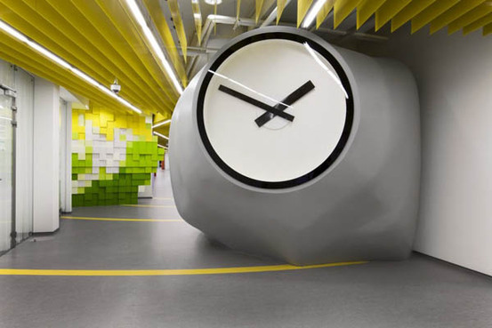
(below) If a tenant does not have the ability to modify walls or paint color, another approach beyond collaborative & versatile privacy panels is just that privacy panels ('Openest' from Haworth) that can wrap a surface or become a free standing art installation in themselves to contemplate on.
Instant color!
http://haworth.com/featured/neocon-2014/neocon
Instant color!
http://haworth.com/featured/neocon-2014/neocon
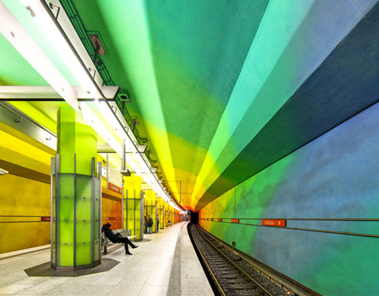
Often our commute becomes an extension of our office. As part of of daily ritual, having color 'pop' in unexpected spaces offers a cheerful beginning and end to one's day whether in a subway, train station or corner coffee house.
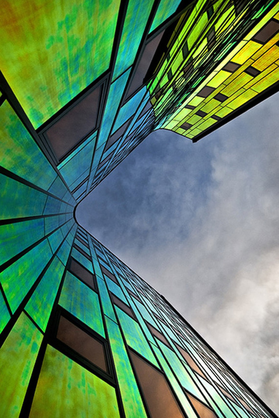
Seeing one's building in new ways based on color and light play throughout the day can be an unexpected refreshing experience in itself.
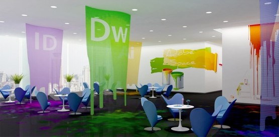
Companies like Adobe and others in the creative market sector know it is color that built them and without the availability of such a spectrum, their business models may have never launched as successfully. Color takes center stage in their interiors for good reason.
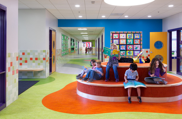
There is an interesting debate regarding K-5 children's classroom decor is going on. Recent studies suggest that too much misc. artwork hung up can be distracting and at times overwhelming for young students Perhaps the better solution might be to insert colorful walls and/or furnishings with negative wall space to introduce new learning subjects. Less can be more but careful not to tip into less is a bore.
Then students may lose interest and require more attention to stay on task.
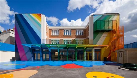
The Jean Lurcat High School & the Thompson Elementary school in Arlington Mass. (below) seem to have found the right balance of inspiration for students whether in high school or kindergarten.
http://modernhouseinsight.com/cheerful-kindergarten-architecture-and-room-design-in-paris-2012-07-05
Then students may lose interest and require more attention to stay on task.
The Jean Lurcat High School & the Thompson Elementary school in Arlington Mass. (below) seem to have found the right balance of inspiration for students whether in high school or kindergarten.
http://modernhouseinsight.com/cheerful-kindergarten-architecture-and-room-design-in-paris-2012-07-05
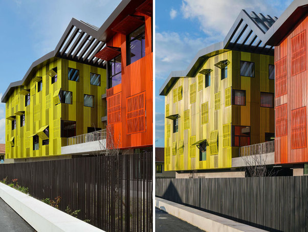
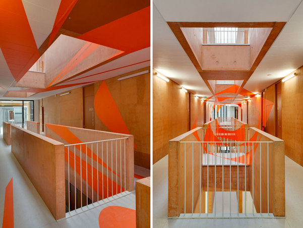
(Below) "The ‘Jean Lurçat High School and gymnasium’ is positioned just outside of Paris in Saint-Denis, France. designed by Mikou Studio, the learning institution is composed of five trapezoidal volumes which are connected by buffer areas (glass clad walkways) which open onto planted patios that allow views towards the neighboring park. an undulating pleated roof of glass surfaces and metal panels visually connects the individual buildings which are each clad in a different colored corrugated stainless steel–polished and perforated to varying degrees– adding dimension to the architectural geometries expressed. in the summer, this overhead structure protects the patios from overheating, creating micro climates within the terraced green areas. the lobby is entirely glazed and opens onto the playground and forecourt with an 8.5 meter cantilever, with a suspended staircase leading one up to access the library on the upper floor. the interior is a construction of simple concrete and timber acting as a backdrop to the artwork by Felice Varini which adorns the main stairwell of the school. standing independently from the education blocks is a gymnasium, keeping studies and leisure separated. the complex offers a dynamic burst of color to the quiet landscape of its location."
http://www.designboom.com/architecture/mikou-studio-completes-high-school-jean-lurcat-near-paris/
http://www.designboom.com/architecture/mikou-studio-completes-high-school-jean-lurcat-near-paris/
Below: The high school interior 1st/2nd floor stairwell
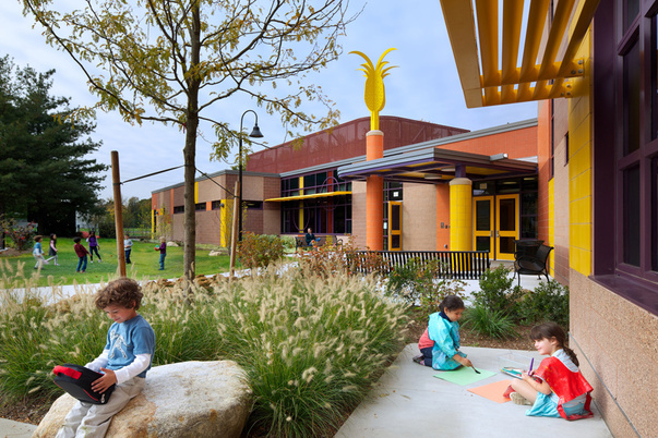
The Thompson Elementary School, Arlington MA. (below) By HMFH Architects, Inc. exemplifies the perfect marriage of architecture and interior design. Color theory at its best supported by familiar shapes, a yellow pineapple, a beacon of optimism & welcome atop of structural supports.
A harmonious achievement that exudes creativity and learning.
Link to project: http://www.hmfh.com/Portfolio/PublicK12/ArlingtonThompsonElementary.aspx
A harmonious achievement that exudes creativity and learning.
Link to project: http://www.hmfh.com/Portfolio/PublicK12/ArlingtonThompsonElementary.aspx
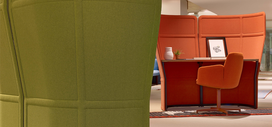
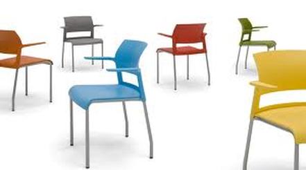
One place designers can start to inject color is in specified seating. Purposeful, functional seating that responds to the user. In this instance for the high school and college student alike. The 'Node' chair by Steelcase provides collaborative support and a place for that ever growing-backpack despite paperless/laptop implementation.
To learn more: http://360.steelcase.com/wp-content/uploads/2011/02/360_Issue59_What%E2%80%99sNewatNeoCon.pdf
To learn more: http://360.steelcase.com/wp-content/uploads/2011/02/360_Issue59_What%E2%80%99sNewatNeoCon.pdf
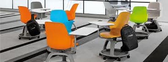
Above & Below...the 'Node' chair by Steelcase.
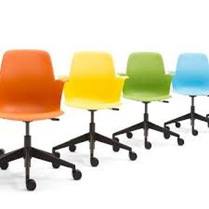
"The Move chair (below) will soon be available with a non-upholstered seat and 12 color options for the seat and back. The five existing color options will remain and seven new colors will be added. This fun-loving chair is even more fun with mix-and-match colors on seats and backs to create multiple (well, 144, to be exact) color combinations."
http://360.steelcase.com/wp-content/uploads/2011/02/360_Issue59_What%E2%80%99sNewatNeoCon.pdf
http://360.steelcase.com/wp-content/uploads/2011/02/360_Issue59_What%E2%80%99sNewatNeoCon.pdf
From labs to middle school round table discussions, furniture designs are emerging out of 2-3 color options to an array of inspiration and fun.
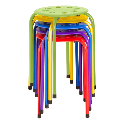
The Norwood Collection stool: http://blog.schooloutfitters.com/2012/12/colorful-plastic-stack-stools/
The Norwood Collection stool: http://blog.schooloutfitters.com/2012/12/colorful-plastic-stack-stools/
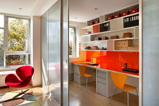
Moving into the home market, classic furniture is being offered in mesmerizing take home versions of the original designs from Knoll and Herman Miller's pop-up stores alike. Furniture mixed with color impact walls can make not only a statement but if the color is an energizing orange your 'work from home' situation may soon outperform your in-office peers who have only beige on beige to gaze upon.
http://www.decoist.com/2014-06-03/small-home-office-design-ideas/
http://www.decoist.com/2014-06-03/small-home-office-design-ideas/
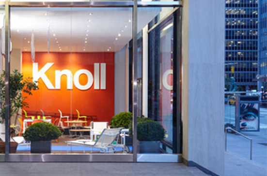
(Below) "The Knoll Home Design Shop is our first direct-to-consumer retail store. The Shop is located at 1330 Avenue of the Americas in midtown Manhattan, around the corner from The Museum of Modern Art."
http://www.knoll.com/flagship-retail-shop
http://www.knoll.com/flagship-retail-shop
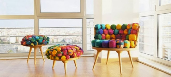
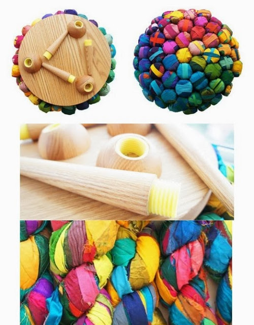
Should you prefer to create an inspirational corner/niche...many environmental re-purposed furniture solutions (below made of silk knots) are coming to market that are not only color mind-bending but comfortable.
(Below) http://www.designinlivingspaces.com/p/furniture.html
(Below) http://www.designinlivingspaces.com/p/furniture.html
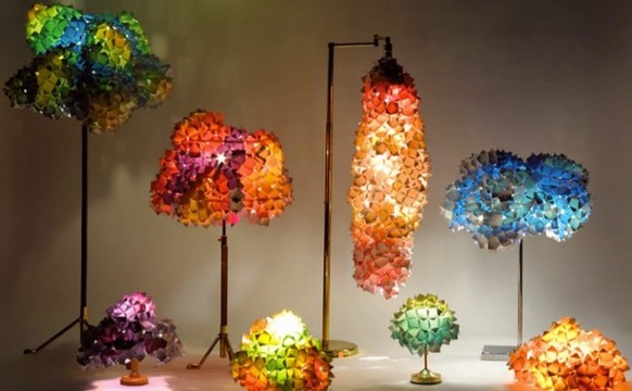
No matter, how you decide to color your world, consider doing so in bold strokes verses conservative gestures. It may be a lamp at first like the "Pixel Lamp" below but perhaps the wall behind the lamp next week.
Regardless of your taste...remember Life as Artful expressions may be well worth the creative pursuit.
http://www.home-designing.com/2011/09/pixel-inspiration-in-decor/pixel-lamps-colorful-2
Regardless of your taste...remember Life as Artful expressions may be well worth the creative pursuit.
http://www.home-designing.com/2011/09/pixel-inspiration-in-decor/pixel-lamps-colorful-2