Jan 2021 COMPLIMENTS
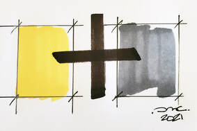
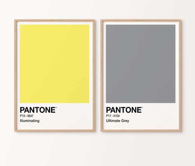
Color and color theory, the practice of, has driven the design industry for years in application of material finishes as well as the design industry in fashion and all products related. Often when the Pantone color of the year is announced, designers hold their breath hoping to exhale in joy of favoritism of the color selected after many in depth meetings and collaboration by color marketing group members and industry insight contributors. Part science, part politics, and part economy as the color emerges as the front runner. Yet this year we have two...a tie per say and they naturally compliment one another. One could say one is dawn and one is dusk, another could say the best of modernism vibrant primary yellow with melancholy sublime grey to tone down the outward "Illuminating" exuberance.
However one regards the two color choices one thing is clear-we needed the yellow to brighten our day, work and design set forth in 2021.
The grey is a given modernists "Ultimate" favorite in broad spectrum specification usage-a safe choice always... as compliments on the color wheel agree.
However one regards the two color choices one thing is clear-we needed the yellow to brighten our day, work and design set forth in 2021.
The grey is a given modernists "Ultimate" favorite in broad spectrum specification usage-a safe choice always... as compliments on the color wheel agree.
Esty artists alike wasted no time celebrating the choices..in print and painting the complimentary colors have taken center "shopping cart" stage.
Source: https://www.etsy.com/listing/912591354/53
Source: https://www.etsy.com/listing/912591354/53
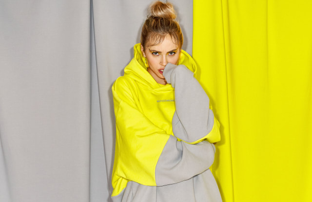
"....For the second year in a row, Russian casual ready-to-wear label Monochrome has partnered with the Pantone Color of the Year to design a limited-edition garment. Following the premiere of Pantone’s 2021 Colors of the Year — Illuminating and Ultimate Gray — the brand debuted a signature oversize hoodie in a bold, color-blocked design in the hues."
Source: https://wwd.com/fashion-news/fashion-scoops/pantone-color-of-the-year-partners-with-monochrome-1234680992/
Source: https://wwd.com/fashion-news/fashion-scoops/pantone-color-of-the-year-partners-with-monochrome-1234680992/
The love affair with vibrant illuminating yellows and ultimate greys has been celebrated many times over the last century.
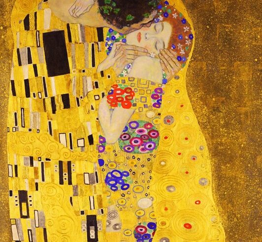
Above, The Kiss by Klimt painted in 1907.
Abstract color blocking in yellow and greys started to emerge in geometric symbolists movement with Japanese influence as seen in the male cloak.
Above, The Kiss by Klimt painted in 1907.
Abstract color blocking in yellow and greys started to emerge in geometric symbolists movement with Japanese influence as seen in the male cloak.
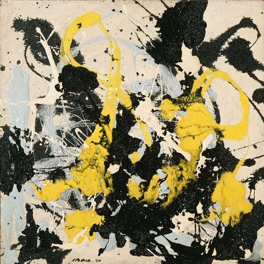
Jackson Pollock's Number 22 painting from 1950 advanced color blocking with yellow and grey.
Source: Philadelphia Museum of Art, Pennsylvania / Bridgeman Images. © 2015 Pollock-Krasner Foundation / Artists Rights Society (ARS), New York
Source: Philadelphia Museum of Art, Pennsylvania / Bridgeman Images. © 2015 Pollock-Krasner Foundation / Artists Rights Society (ARS), New York
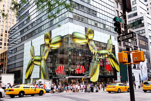
Jeff Koons, in collaboration with H&M, joined art with grand visual merchandising scale.
Koon's yellow balloon dog sculpture packed visual impact against the grey backdrop of a NYC building... attracting customers.
Artful & impactful.
Image: NY Times
Koon's yellow balloon dog sculpture packed visual impact against the grey backdrop of a NYC building... attracting customers.
Artful & impactful.
Image: NY Times
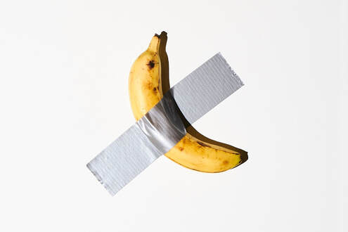
Fast forward to 2019 and the $120,000 Banana Wins Art Basel-was it the artful expression or
the striking complimentary colors of yellow & grey that attracted art enthusiasts?"....All he needed was a banana and some duct tape. In a gesture straight out of the Duchamp playbook, Mr. Cattelan emerged from productive hibernation with his first sculpture created for an art fair in 15 years. The piece, titled “Comedian,’’ was the endpoint in a creative process that saw him cycling through renditions of the fruit in resin and bronze, before settling on the real thing." NY Times
the striking complimentary colors of yellow & grey that attracted art enthusiasts?"....All he needed was a banana and some duct tape. In a gesture straight out of the Duchamp playbook, Mr. Cattelan emerged from productive hibernation with his first sculpture created for an art fair in 15 years. The piece, titled “Comedian,’’ was the endpoint in a creative process that saw him cycling through renditions of the fruit in resin and bronze, before settling on the real thing." NY Times
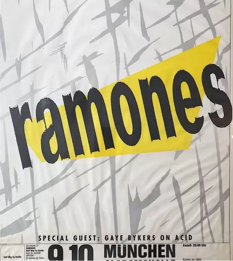
1987 Poster of a Ramones concert graphically added impact to the edgy punk band as the yellow grabbed one's attention and the grey paint strokes personified abstract art.
Source: https://madvanantiques.com/products/rare-ramones-concert-poster-from-munich-germany-1987
Source: https://madvanantiques.com/products/rare-ramones-concert-poster-from-munich-germany-1987
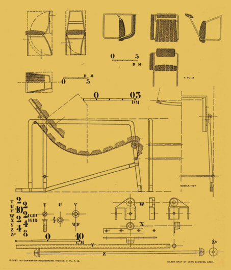
Transitioning into the realm of design and architecture, Eileen Gray Designs also embraced modernist yellows in conveyance and impact dating to the turn of the 20th century.
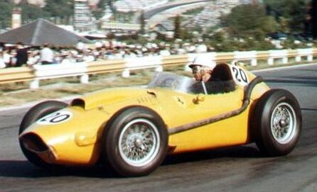
Olivier Gendebien Belgium 1958 & since Formula 1 has consistently had yellow "stand-out" car paint colors set against greys and black.
Source:www.formula1.com
Source:www.formula1.com
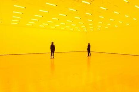
1 of 19 Room for one color, 1997 Tate Modern, London were a color emersion art installation of yellow illumination from every corner inward.
Photo: Anders Sune Berg
Photo: Anders Sune Berg
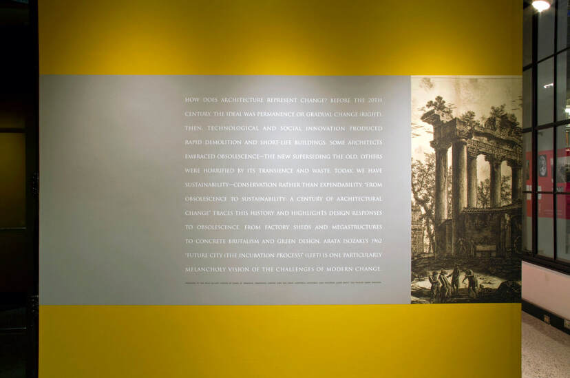
MIT's use of yellow and grey backdrop rhetorical questions of museum visitors in bold colorway at the entry to exhibits on architecture.
Source: https://www.montie.net/work/from-obsolescence-to-sustainability-a-century-of-architectural-change
Source: https://www.montie.net/work/from-obsolescence-to-sustainability-a-century-of-architectural-change
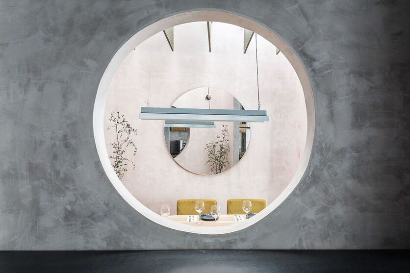
Spanish studio Lucas y Hernández-Gil looked to the subdued paintings of artist Giorgio Morandi when creating the greyscale interiors of Casaplata restaurant in Spain. Opened ~ 2018.
Source: Dezeen
Source: Dezeen
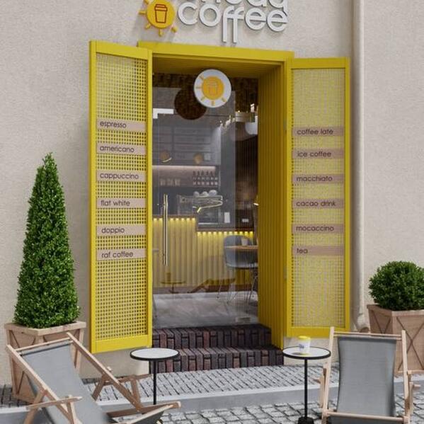
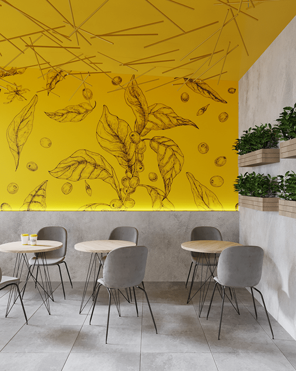
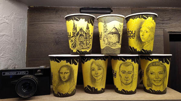
(Below) Third Places (spaces), the commons of a town center or cityscape are public areas that attract and allow for ideal exchange of thought and moment.
The local corner coffee shop exemplifies Ray Oldenburg's' theory & thinking on the quintessential Third Place.
Here bold yellow and gray dominate the interior space in contemporary hues.
Dotted within the space is expressive artwork that beckons and captivates the new customer effectively.
Source: https://sunday-coffee-lviv.business.site/
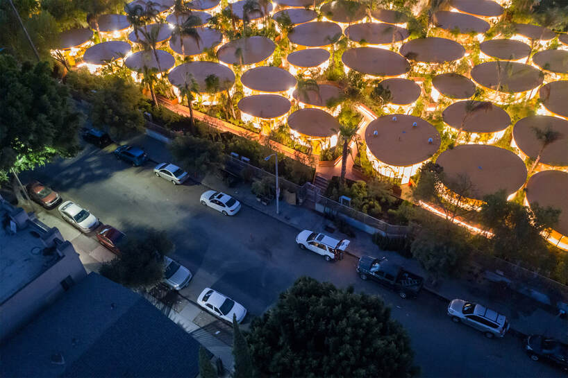
"....Designed by Spanish architects SelgasCano, a Los Angeles workspace has popped up in a formerly empty parking lot in Hollywood. The recently opened SecondHome Hollywood boasts a 50,000-square-foot garden of 6,500 trees and plants and 700 tons of soil and vegetation. It is Los Angeles’s densest urban forest and is also home to 112 native species.
The Hollywood location, which is the first in the United States, contains sixty yellow-roofed office pods. It also encompasses the Anne Banning Community House, a ’60s building designed by prominent architect Paul Williams who is known for defining much of Los Angeles’s architectural aesthetic throughout the 20th century. (via Jeroen Apers)".
Source: https://www.thisiscolossal.com/2019/12/second-home-hollywood/
Let's see where we can take our 2021 "Illumining" creative efforts this year to the trees tops and back I say... the "Ultimate" strive.
Happy New Year!
Happy New Year!